Ask ten people to look at the same painting and, if it's working, nine of them will look at the same spot first. That spot is the focal point — and learning to control where it lands is the single biggest jump most of us make once we get past the beginner stage. You can have the drawing right, the colors mixed well, and the values mostly in order, and the piece can still feel scattered. Usually that's because the focal point in painting terms — the place the eye is meant to settle — was never actually decided. The good news: focal points aren't a mystery. They're a handful of tools you can learn to use on purpose.
This is a guide for the painter who's past "which end of the brush" and into "why isn't this working." We'll cover what a focal point actually does, the five tools painters use to create one, how the masters did it, how to tell when your own piece is missing one, and where to put it once you've got it.
What a Focal Point Actually Does
A focal point is the area you want the viewer to notice first and return to most. But here's the part that gets lost in most explanations: it is not a bullseye the viewer is supposed to stare at to the exclusion of everything else. A good focal point is more like the front door of a house — the place the eye enters, pauses, and then sets off to explore the rest before circling back.
That distinction matters because it changes how hard you push. Some paintings want a loud, unmistakable focus. Others — a quiet, foggy field; a vast desert — work because the focus is soft and the mood carries the piece. Edgar Payne, in his classic Composition of Outdoor Painting, built his teaching around the idea of dominance: one element clearly leading, with everything else in a supporting role. Dominance is the principle; how strongly you assert it is a judgment call, not a rule.
One more thing worth saying early: the focal point doesn't have to be the subject. Picture a single dark fence post against a huge luminous sky. The post grabs your eye instantly — but the painting is really about the sky. The post is just the hook that gives the sky scale and a way in. Sometimes the focal point is the subject; sometimes it's a foil that serves it. Both are fine.
The Five Tools Painters Use to Create a Focal Point
Every focal point comes down to contrast — making one area different from the field of "average" around it. In daylight, most of what you see sits in a middle range of tone and color, with darks and lights scattered here and there. Those scattered exceptions are where the eye goes. As painters, we get to decide where to put the exceptions. Here are the five strongest levers, roughly in order of power.
1. Value contrast (the strongest by far)
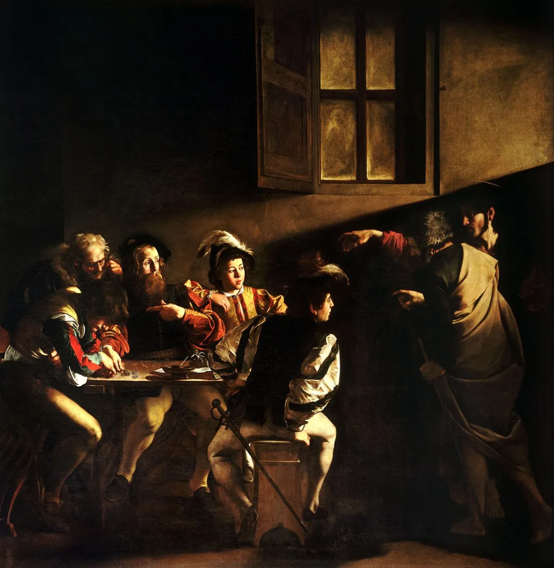
Value — how light or dark a passage is — is the most powerful tool you have. The eye is drawn to the place where light meets dark most sharply. If you take nothing else from this article, take this: put your strongest value contrast at the focal point, and keep the contrast quieter everywhere else.
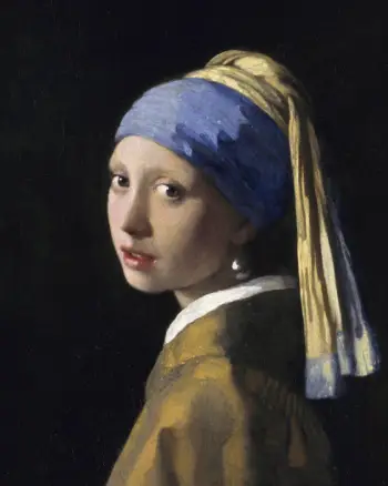
Vermeer drops the background to near-black so the lit face has nowhere to hide. There's no trick beyond that one decision, and it's enough.
2. Color saturation
A spot of pure, saturated color in a field of muted, grayed color will pull the eye every time. The classic move is one or two notes of intense color against a neutral surround — a red umbrella on a gray, rainy street. You don't need much. In fact, the more neutral the rest of the painting, the less saturated color it takes to create a focus.
3. Edge sharpness (hard vs. soft)
A crisp, hard edge reads as "in focus" and pulls attention; soft, lost edges recede. This is how your own eyes work — only the thing you're looking at is truly sharp. So keep your hardest edges at the focal point and soften edges as you move away. A painting with uniformly hard edges everywhere has no focus, because nothing stands out.
4. Detail density
The eye goes to where there's the most information. A passage of fine detail surrounded by simpler, broader shapes will read as the focus. The corollary is the useful part: you can quiet a competing area simply by simplifying it — fewer marks, broader shapes, less to read.
5. Convergence of lines
Lines that point — a road, a shoreline, the direction of a gesture, the angle of a gaze — funnel the eye toward wherever they meet. This is the leading-lines effect, and it's strong enough to override the others if you're not careful. (We go deep on this in Leading Lines in Art.)
In practice you rarely use just one. The strongest focal points stack two or three — high value contrast and a touch of saturation and a hard edge, all in the same spot. That convergence is what makes a focus feel inevitable rather than fussy.
Famous Paintings, Famous Focal Points
The fastest way to train your eye is to look at how the masters did it and name the tool.
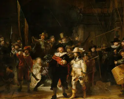
In The Night Watch, Rembrandt has a whole crowd to manage. He picks out Captain Cocq with light, a step forward, and the warmest note in the picture — value, position, and color, all at once. The full painting is in the Rijksmuseum's permanent collection, where their high-resolution scan makes it possible to study every tool he uses in detail.
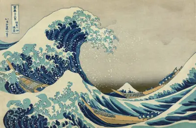
Hokusai is the clever one here. The wave dominates the scale, but the focal point is little Mount Fuji, sitting quietly where the curve of the wave funnels your eye. Drama and focus aren't always the same object. The print is in the Metropolitan Museum of Art's open-access collection and is worth studying at full resolution — Fuji's placement feels accidental until you notice how precisely the wave arms frame it.
Not every great example is one I can show you here — some are still under copyright, so I'll describe them. In Edward Hopper's Automat (1927), the focal point is the woman's face: it's the lightest, sharpest, most detailed passage in an otherwise dim, simplified room. Hopper isolates her with empty space and a wall of dark window behind her, and your eye has nowhere else to go. It's the same toolkit — value, edge, detail — used with enormous restraint.
How to Tell When Your Painting Has No Focal Point
This is the part you actually came for. When a painting "feels off," "looks flat," or "just isn't working" and you can't say why, a missing or competing focal point is the usual culprit. Here's how to diagnose it.
Squint at it. Squint until the detail drops away and you see only big blobs of light and dark. If your eye doesn't immediately land somewhere — if the whole thing reads as one even gray — you have no value focus. (More on this in The Value Scale in Art.)
Count your contrasts. Walk the painting and ask: how many places have strong value contrast? How many spots of saturated color? How many hard edges? If the answer is "everywhere," that's the problem. When everything shouts, nothing is heard. Pick one area to win and pull the others back.
Look for competing focal points. Two equally strong areas create a tie, and the eye ping-pongs between them, never settling. The fix is rarely to strengthen one — it's to weaken the other. Soften its edges, drop its contrast, desaturate it.
Check for dead center. A focal point parked exactly in the middle tends to freeze the composition. The eye locks on and stops exploring. Which brings us to placement.
Where to Put the Focal Point
Once you know what your focus is, you have to decide where it sits. A few reliable options:
- On a rule-of-thirds power point. Place the focal point roughly a third of the way in from two edges. It's the most dependable starting move and almost always beats dead center. (Full guide: Rule of Thirds in Art.)
- At the golden ratio or the rabatment of the rectangle. Slightly more sophisticated cousins of the thirds. Useful when the thirds feel too mechanical.
- Anywhere but the exact center — unless you specifically want the still, formal, symmetrical feeling that dead-center placement gives (think a frontal portrait or an icon).
There's no single correct spot. The point is to decide — not to let the focal point land in the middle by default.
Focal Points in Abstract Painting
A common question: does an abstract art focal point even exist? Yes — and the same five tools apply, just without recognizable subjects. In a Rothko, the focus is the soft boundary where two color fields meet and vibrate. In a Mondrian, it's the asymmetry — one slightly larger color block, or the one spot where the black lines cross differently. In a de Kooning, it's the densest knot of gesture and contrast in the field. Abstraction doesn't remove the focal point; it just makes value, color, edge, and density carry the whole job.
See Where the Eye Lands in Your Own Work
Here's the hard part about your own paintings: you know where you meant the focus to be, so your eye goes there automatically. You can't see your own piece the way a stranger does. That bias is exactly why an outside read is so useful.
Interestingly, the illustrator James Gurney has run actual eye-tracking experiments on his own paintings — having people look while a program recorded where their eyes lingered, producing a heatmap of attention. He even has a name for engineering a focus by surrounding it with contrast: "flagging." Critico's focal-point heatmap works on the same idea, instantly: drop in your painting and it shows you where the eye is actually pulled first — which is often not where you intended.
If the heatmap lights up somewhere you didn't expect, you've found your competing focal point. Now you know exactly what to quiet down.
Frequently Asked Questions
- What is a focal point in a painting? The focal point is the area you want the viewer to notice first and return to most — created by contrast in value, color, edge, or detail. It's the visual "front door" of the painting.
- How many focal points should a painting have? One primary focal point, always. You can add weaker secondary points to keep the eye moving, but one area must clearly dominate, or the eye won't know where to settle.
- Where should the focal point go? Usually on or near a rule-of-thirds power point — about a third of the way in from two edges. Avoid dead center unless you specifically want a still, formal feeling.
- Can an abstract painting have a focal point? Yes. The same tools apply — value contrast, saturation, edge, and detail density — they just work without recognizable subjects.
- How do I find the focal point in my own painting? Squint to see where your eye lands first, count how many strong contrasts you have, and look for competing areas. An outside read, like Critico's focal-point heatmap, removes your own bias about where the focus "should" be.