If you've spent any time reading about composition, you've met the rule of thirds — and almost everything written about it is aimed at photographers. The rule of thirds in art works a little differently for painters, because we don't crop a scene that already exists; we build one from nothing. That changes how the rule is useful. A photographer moves the camera until the subject lands on a line. A painter decides, before a single mark, where the subject should land — and then builds the whole picture around that choice.
This is a guide for the painter who's past the basics and starting to think structurally about why some compositions feel right and others feel stuck. We'll cover what the rule actually is, where the four power points are and what to put on them, how master painters used it, when to ignore it, and how to check your own work.
What the Rule of Thirds Actually Is (and Why Painters Use It Differently)
Divide your canvas into thirds both ways — two vertical lines, two horizontal — and you get a 3×3 grid of nine rectangles. The rule of thirds says: put your important elements on those lines, and your single most important element near one of the four points where the lines cross. That's the whole mechanic.
The reason it works is simpler than it's usually made to sound. Dead-center placement is static — the eye locks on and stops moving. Pushing the subject off-center creates a little tension and room for the eye to travel, which reads as more alive. Robert Henri, the great American teacher, put the goal of composition bluntly in The Art Spirit:
Get the art of controlling the observer — that is composition.
The thirds grid is just one reliable way to do that controlling.
Here's the painter's difference, though. A photographer is finding a composition inside reality and nudging the frame. You're inventing one. So the grid isn't a cropping aid — it's a planning tool. You can decide the horizon will sit on the lower third and the focal subject on the upper-left power point before you draw anything, and then everything you add serves that plan. Used that way, the rule of thirds is less a rule and more a starting skeleton.
The Four Power Points — and What to Put on Them
The four intersections — upper-left, upper-right, lower-left, lower-right — are the strongest spots in the picture. They're where the eye most wants to rest. So they're where you put what matters most:
- The main focal point goes on one power point. (A face, the lit object, the thing the painting is about.)
- The horizon goes on a horizontal third — the upper one if the land matters more, the lower one if the sky does. Never dead-center, which splits the painting into two competing halves.
- A strong vertical — a tree, a figure, a mast — sits on a vertical third rather than down the middle.
- Secondary points of interest can take the other lines and intersections, but kept quieter so they don't fight the main one.
Andrew Loomis, whose drawing books trained generations of illustrators, taught the same instinct from the other direction: keep subjects off dead-center and let the picture's main divisions fall on those informal third-points, so the design breathes instead of freezing. The grid gives you a cheat sheet for exactly that.
Five Master Paintings That Use the Rule of Thirds
The fastest way to internalize this is to lay the grid over paintings you already know.
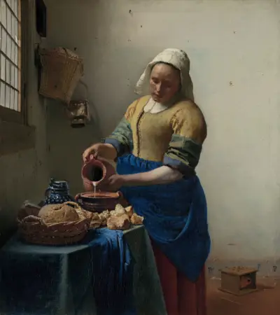
Vermeer — The Milkmaid
Look again at the hero image above. The maid occupies the left vertical third; the bright window light and the thin stream of pouring milk fall right around the upper and central power points. Vermeer didn't need the grid drawn to feel it — but it's unmistakably there. The painting is in the Rijksmuseum's permanent collection, where their high-resolution scan makes it possible to study every decision in detail.
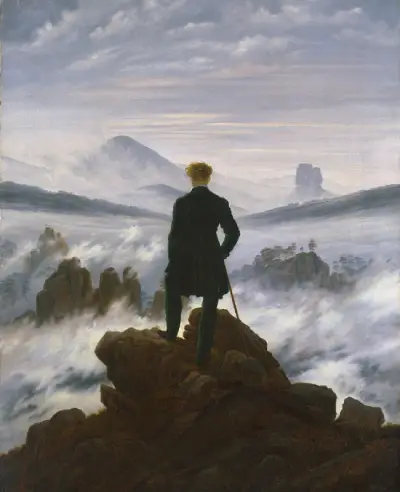
Friedrich — Wanderer above the Sea of Fog
Friedrich places the figure just off-center on a vertical, with the sea of fog filling the lower third and the sky the upper two-thirds. The off-center figure is what makes the scene feel like looking out rather than a centered portrait of a man.

Cassatt — The Boating Party
Cassatt is bolder — the dark figure of the rower fills the lower-left while the mother and child sit on the right third. The empty curve of the sail between them gives the eye its travel path. The painting is in the National Gallery of Art's open-access collection, free to study at full resolution.

Ruisdael — The Windmill at Wijk bij Duurstede
A landscape master move: Ruisdael drops the horizon to the lower third so the dramatic sky gets two-thirds of the space, and stands the windmill on a vertical third where it dominates without being centered.
Hopper — Nighthawks (described, not shown)
For a fifth, here's one I can describe but not show — Edward Hopper's Nighthawks (1942) is still under copyright. The long diner counter runs along a lower third, and the lit interior with its few figures sits in the upper portion; the great empty sweep of dark street fills the lower-left, giving the loneliness room to breathe. Same grid logic, mid-century mood.
When to Break It — and Why It Still Works
The rule of thirds is a default, not a law. Plenty of masterpieces ignore it on purpose:
- Dead-center, deliberately. A frontal, symmetrical portrait or an icon wants the stillness that centering gives. Da Vinci's Last Supper puts Christ dead center — the symmetry is the point. Centering isn't wrong; it's a specific tool for a specific feeling.
- Radical asymmetry. Some compositions push the subject hard to one edge for tension the thirds wouldn't give.
- The golden ratio or rabatment. Slightly more refined cousins of the thirds, useful when the grid feels too mechanical. (More on that in The Golden Ratio in Art.)
The point isn't to obey the grid — it's to make placement a decision. The rule of thirds is what keeps you from the one genuinely weak default: dropping everything in the middle because you didn't choose.
Why Your Painting Feels Unbalanced — and How the Thirds Fix It
When a painting feels "off" or "unbalanced" and you can't name why, placement is often the cause. A few self-checks:
Is your subject centered by accident? Centered subjects with asymmetric surroundings often feel awkward — neither the stillness of true symmetry nor the energy of an off-center design. Slide the subject toward a power point and watch it settle.
Is your horizon splitting the canvas in half? A dead-center horizon reads as two paintings stacked on top of each other. Drop it or raise it to a third and commit to which half is the star.
Is everything equally spaced? Even spacing reads as monotonous. The thirds break the canvas into unequal parts, and unequal is more interesting to the eye.
How to Check Your Own Painting Against the Rule of Thirds
You can eyeball a grid, but it's hard to be honest about your own work — you already know where you meant things to go. Dropping an actual thirds grid over the piece shows you where they actually sit. Critico does this in one step: upload your painting and toggle the rule-of-thirds overlay to see whether your focal point and horizon land where you thought.
If your subject is sitting closer to the center than you realized, you've found why it feels static — and exactly how far to nudge it.
Frequently Asked Questions
- What is the rule of thirds in art? Divide the canvas into thirds both ways to make a 3×3 grid. Place important elements on the lines and your main focal point near one of the four intersections (power points). It keeps compositions from feeling static and centered.
- How is the rule of thirds different for painters than photographers? Photographers use it to crop a scene that already exists; painters use it to plan a scene from scratch, deciding where the subject and horizon should sit before making a mark.
- What are the power points in the rule of thirds? The four points where the grid lines cross — upper-left, upper-right, lower-left, lower-right. They're the strongest resting spots for the eye, ideal for the main focal point.
- Should I always follow the rule of thirds? No. It's a reliable default, not a law. Symmetry (dead center) suits formal, still subjects; the golden ratio suits more refined placement. The goal is to make placement a deliberate choice.
- How do I check the rule of thirds in my own painting? Overlay a thirds grid on the piece and see where your subject and horizon actually fall. Critico's rule-of-thirds overlay does this instantly so you can compare intent against reality.
Related reading
- Focal Point in Painting: Guiding the Viewer's Eye — the five tools that keep the eye at your subject once you've placed it on a power point.