Few ideas in art are as seductive — or as oversold — as the golden ratio. You've probably seen the spiral laid over the Mona Lisa, a nautilus shell, and a sunflower, with the implication that a single magic number secretly governs all beauty. The truth is more useful and more honest than the myth. The golden ratio in art is a real proportion that genuinely creates pleasing, balanced compositions — but a lot of what's claimed about it is cherry-picked after the fact. This guide sorts the practical from the mystical, so you can actually use it.
It's written for the painter who's getting serious about composition and wants the straight story: what the ratio is, the few works where it was demonstrably used on purpose, how much of the rest is wishful thinking, and how to put it to work in your own paintings without turning every canvas into a geometry assignment.
What the Golden Ratio Is (in One Paragraph, Without the Mysticism)
Take a line and divide it into two parts so that the whole is to the longer part as the longer part is to the shorter. That ratio works out to about 1.618, written with the Greek letter phi (φ). A rectangle whose sides are in that proportion — roughly 1 to 1.618 — is a golden rectangle. Its defining trick: slice a perfect square off one end, and the leftover rectangle is another golden rectangle, smaller but identically proportioned. You can repeat that forever, and connecting the corners of those nested squares with a curve traces the famous golden spiral. That's the whole concept. Everything else is application.
Phi, Fibonacci, the Golden Rectangle, and the Golden Spiral — One Idea, Four Faces
These four terms get used interchangeably and confuse everyone, so here's how they connect:
- Phi (φ ≈ 1.618) — the number itself.
- The Fibonacci sequence (1, 1, 2, 3, 5, 8, 13…) — each number is the sum of the two before it. Divide any number by the one before it and you get closer and closer to phi. It's the ratio showing up in a counting pattern.
- The golden rectangle — a rectangle in the 1:1.618 proportion. The most directly useful form for a painter, because a canvas is a rectangle.
- The golden spiral — the curve traced through the nested squares of a golden rectangle. The most visually dramatic form, and the one usually laid over paintings.
For practical painting, the rectangle and the spiral are what you'll actually reach for.
Famous Paintings That Use the Golden Ratio
Here's where honesty matters, because the examples fall into two very different buckets: works where the artist demonstrably chose the ratio, and works where someone found it afterward.
The cleanest, least-disputed example is Salvador Dalí's The Sacrament of the Last Supper (1955) — which, because it's still under copyright, I'll describe rather than show. Dalí deliberately made the canvas a golden rectangle, and he framed the scene inside an enormous dodecahedron — a twelve-sided solid whose geometry is bound up with phi. He wasn't guessing; he was a known enthusiast of mathematical mysticism and chose these proportions on purpose for their symbolic weight. Dalí himself said he wanted to capture a "Pythagorean" sense built on the number twelve. When a painter tells you they used the ratio and the measurements back them up, that's the real thing. The painting is in the permanent collection of the National Gallery of Art in Washington.
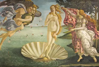
Botticelli's Birth of Venus is the classic citation: Venus's figure and the canvas divisions are often shown fitting golden proportions. It's a beautiful fit — but it sits closer to the second bucket. We have no record that Botticelli set out to use phi, and a composition this harmonious will accommodate a golden overlay whether or not it was planned.
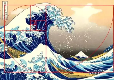
Hokusai's Great Wave is the most satisfying overlay of all — the spiral seems to ride right along the curl of the wave into the trough. Did Hokusai calculate phi? Almost certainly not. He had a superb instinct for spiraling, dynamic composition, and the golden spiral is itself a very natural, balanced curve — so a great curving composition and the spiral tend to agree. That's the honest read.
And the most famous claim of all, the Mona Lisa: you've seen the golden rectangle drawn around her face. Worth knowing — there's no documentation that Leonardo consciously used the ratio there, and the "rectangle" can be drawn several different ways to make it fit. Leonardo was close with the mathematician Luca Pacioli, who literally wrote the book on the ratio (Divina Proportione, which Leonardo illustrated), so he certainly knew it existed. But "knew it existed" and "secretly built the Mona Lisa on it" are very different claims.
How Much of This Is Real, and How Much Is Cherry-Picked?
Here's the part most articles won't tell you. The golden ratio is genuinely a pleasing proportion — that part is real, and there's some evidence people mildly prefer golden-ish rectangles. But three things inflate the myth:
- It's close to other good proportions. The golden rectangle (1:1.618) is very near the rule-of-thirds proportion and other simple harmonious ratios. So any well-composed painting will approximately fit a golden overlay — not because phi was used, but because good composition clusters in the same neighborhood.
- The overlay is flexible. You can scale, rotate, and position a golden spiral several ways over any image. Try enough placements and one will "line up."
- We remember the hits. Nobody publishes "I overlaid the spiral and it didn't fit." The examples that circulate are the ones that happened to work.
None of that means it's useless. It means: use it as a compositional tool that reliably produces balance, not as a mystical law that guarantees beauty. That honest framing is exactly what makes it worth using.
How to Use the Golden Ratio Without Overthinking It
You don't need a calculator. A few practical moves:
- Place your focal point near the spiral's tightening. Where the spiral coils in toward its center is a strong, natural resting spot — drop your main subject there.
- Use the golden rectangle's divisions like a refined rule of thirds. The lines where the squares meet are good places for horizons, strong verticals, and secondary elements. (If this sounds familiar, it should — see Rule of Thirds in Art. The golden divisions are a slightly more elegant cousin.)
- Let it guide, not dictate. Block in your composition, then check it against the ratio and nudge — rather than starting from the spiral and forcing the subject to obey.
The spiral's terminus also tends to make a natural focal point, which is why a golden overlay and a focal-point check so often agree. (More on finding that point in Focal Point in Painting.)
Practical Workflow: Where to Put the Spiral on a Blank Canvas
Starting a new piece and want to use the ratio deliberately? A simple sequence:
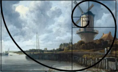
- Decide your canvas proportion first. A canvas close to 1:1.618 makes the whole system cleaner, but any rectangle works. The Rijksmuseum's scan of Ruisdael's windmill is worth studying here — the canvas dimensions themselves are close to a golden rectangle.
- Lay the golden rectangle subdivisions over your blank surface. Note where the squares divide and where the spiral coils tightest.
- Put your most important element near that coil, with the horizon or a major edge on one of the division lines.
- Build outward, keeping the big shapes loosely echoing the divisions.
- Then forget the grid and paint. The proportion has done its job once the bones are placed; don't let it micromanage every stroke.
See the Golden Spiral on Your Own Painting
The fastest way to understand the ratio is to watch it land on real paintings — including your own. Critico draws a true golden-rectangle overlay (and lets you rotate it through all four orientations) right on top of your image, so you can see where the spiral coils and whether your focal point sits near it.
Try it on a painting you already like the composition of. Often you'll find your instinct already put the focal point near the spiral — which is the real lesson of the golden ratio: good composition and the ratio tend to arrive at the same place. Once you can see your value structure clearly, you'll notice the two strongest values usually align with where the spiral coils.
Frequently Asked Questions
- What is the golden ratio in art? The golden ratio (phi, ≈ 1.618) is a proportion where the whole relates to the larger part as the larger part relates to the smaller. A golden rectangle uses this proportion and is considered naturally balanced and pleasing in composition.
- Did the old masters really use the golden ratio? Some did deliberately — Salvador Dalí's The Sacrament of the Last Supper is the clearest case. Many famous examples, like the Mona Lisa, are unproven; the ratio was found afterward rather than documented as intentional.
- What's the difference between the golden ratio, golden rectangle, and golden spiral? Phi is the number (≈1.618); the golden rectangle is a rectangle in that proportion; the golden spiral is the curve traced through the nested squares of a golden rectangle. They're three forms of one idea.
- Is the golden ratio better than the rule of thirds? Not better — close. The golden proportion sits near the rule-of-thirds proportion, so both produce balanced placement. The golden ratio is a slightly more refined guide; the rule of thirds is quicker to use.
- How do I use the golden ratio in my own painting? Place your focal point near where the golden spiral coils, put horizons and strong lines on the rectangle's divisions, and let it guide rather than dictate. Critico's golden overlay shows you the spiral on your own work.
Related reading
- Rule of Thirds in Art: A Painter's Guide — the quicker, equally reliable cousin of the golden ratio, and a good place to start if the spiral feels like too much.
- Focal Point in Painting: Guiding the Viewer's Eye — where the spiral coils is where the focal point wants to live; this explains why.
- The Value Scale in Art — before placement matters, the value structure has to hold up. This is where to start if your composition feels weak.