There's an old saying among painters: value does the work, but color gets the credit. It's a cliché because it's true. You can mix a gorgeous color and place it perfectly, and the painting can still fall apart — because the value scale in art (value being how light or dark something is, regardless of its color) is the structure everything else hangs on. Get the values right and a limited palette will sing. Get them wrong and the most beautiful colors in the world turn to mud.
If your paintings sometimes feel flat, muddy, or strangely lifeless and you can't figure out why, this is very often the reason — and it's a fixable one. This guide is for the painter who's comfortable enough with the materials to start thinking structurally: what a value scale is, why it outranks color, how the masters used it, and the practical tools (including the squint test and its more precise digital cousin) for seeing your own values clearly.
What a Value Scale Is and Why It Matters More Than Color
A value scale is simply a strip running from pure white at one end to pure black at the other, with steps of gray in between. Every color you can mix also has a value — squint at a lemon and a navy sweater and you're reading their values, not their hues. That's the key idea: color and value are separate properties, and value is the one that carries the structure.
Why does value outrank color? Because the eye reads value first. We evolved to make sense of light and dark — form, depth, where one thing ends and another begins — long before we worried about whether something was red or green. A painting with strong, clear value organization will read from across the room. A painting with gorgeous color but muddy, samey values will look weak no matter how lovely the hues are up close.
This is the lineman-and-running-back relationship: value does the unglamorous structural work while color gets the compliments. When someone says "I love your colors," the real reason it works is usually the value relationships underneath.
The Standard 9-Step Value Scale (and Why Most Painters Use 3, 5, or 7)
The textbook value scale has nine steps: white (1), through middle gray (5), to black (9). It's a useful reference for training your eye to distinguish fine gradations.
But here's the practical secret: in actual composition planning, almost nobody works in nine steps. They simplify down to 3, 5, or 7:
- 3 values (dark, mid, light) — the bones. This is how you plan a composition: where are the big dark shapes, the big lights, the mid-tone field that connects them? If your painting works in three values, it'll work.
- 5 values — the most common working level in art instruction. Enough nuance to describe form without drowning in detail.
- 7 values — closer to the full nine-step range, for when you need more subtle transitions (skin, atmosphere, soft light).
The reason simplification matters: a painting built from a few clear value masses reads as strong and designed. One chopped into dozens of small, similar values reads as busy and weak. The instructor David Leffel put it memorably — a painting made of many small value shapes will look small and petty. Big, clear value masses are what give a picture authority.
Why Your Painting Looks Flat — It's Usually Values, Not Color
When a painting feels flat or muddy, most of us instinctively reach for the color — brighter, more saturated, a different hue. That's almost always treating the symptom. Here's what's usually actually wrong:
- The value range is too narrow. Everything sits in the middle. No real darks, no real lights — so nothing has punch and the form looks soft and uncertain. Fix: push your darkest darks darker and your lightest lights lighter, especially at the focal point.
- The values are all the same across different colors. You've got lots of hues, but they're all roughly the same lightness, so they blur into one tone when you squint. That's the textbook recipe for "muddy." Fix: vary the values, not just the colors.
- There's no clear value plan. The darks and lights are scattered evenly with no big shapes. Fix: group them — a few large dark masses, a few large lights.
The tell for all three is the same: squint at the painting. If it dissolves into one even gray with nothing standing out, the problem is values, not color.
How Master Painters Used Value Structure
Looking at how the masters organized value is the fastest way to train the instinct.
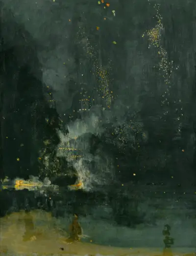
Whistler's Nocturnes are a masterclass in restraint: he deliberately compresses the whole painting into a narrow band of low (dark) values, then places a very few small lights with surgical precision. The limited range is the point — it's what makes them feel like dusk. Nocturne in Black and Gold is held by the Art Institute of Chicago, where their high-resolution scan rewards close study.
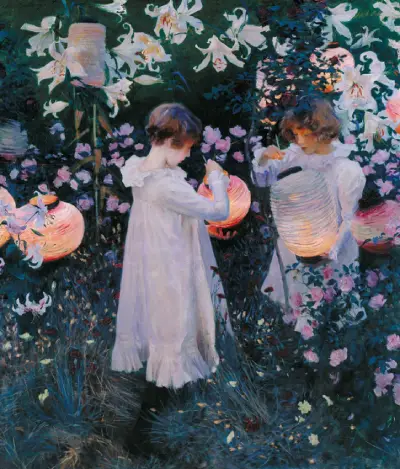
Sargent does the opposite-but-related thing: a mostly mid-value, cool garden at dusk, with the glowing paper lanterns held as the only true high-value notes. The whole painting is built to make those lanterns glow — by keeping everything else lower.
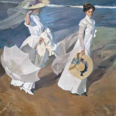
Sorolla pushes the entire range high — bright sun means most values sit at the light end, with just enough darker accents to keep it from washing out. Several of his beach scenes are in the Metropolitan Museum of Art's open-access collection. Whistler low, Sorolla high: both prove that controlling where your values sit on the scale is a deliberate expressive choice, not an accident.
Two more I can describe but not show, as they're still under copyright: Edward Hopper's Nighthawks (1942) puts its most extreme value contrast right at the focal point — the brightly lit diner against the near-black street, so your eye has nowhere else to go. And Andrew Wyeth's Christina's World (1948) uses a wide, carefully controlled value range across the dry field to lead the eye up to the small dark house on the horizon. Same principle, different mood.
How to Do a Value Study Before You Start
A value study is a quick, small sketch — done before the real painting — where you work out only the values: no color, just where the big darks, mids, and lights go. It's the single highest-leverage habit you can build. The plan:
- Go small. A thumbnail a few inches across. Small forces you to simplify.
- Limit yourself to 3 values first. Dark, mid, light. Block in the big shapes only.
- Squint constantly to check you're seeing masses, not details.
- If it works in 3, develop to 5. Add the next layer of nuance only once the bones are sound.
- Then start the painting knowing your value plan is solid — so you can have fun with color without the structure collapsing.
Five Tools Painters Use to See Values Clearly
Seeing value accurately is genuinely hard, because the brain insists on telling you about color. These tools strip color away so you can read value honestly:
- The squint test. Narrow your eyes until detail and color drop out and you see only light-and-dark masses. Free, instant, and every instructor teaches it — but it's imprecise and you can't hold it steady.
- A grayscale photo. Photograph the painting and desaturate it. Removes color entirely — but you have to stop and go to your phone each time.
- A red filter (red acetate). Looking through red glass mutes most hue differences so values pop. Cheap and portable; a bit fiddly.
- A value finder. A card with punched holes in graded grays, held up to compare a passage against known steps.
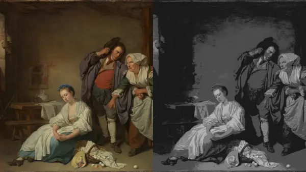
- Posterizing. Reducing the image to 3, 5, or 7 flat values digitally — the most precise version of the squint, because it's exact and holds still for as long as you need.
That last one is where a tool earns its place.
See Your Painting's Value Structure Instantly
The squint test is the painter's oldest trick, but everyone admits it's imprecise — you can't freeze it, and your eyes keep drifting back to color. Posterizing does the same job exactly: it reduces your painting to a chosen number of flat value bands so you can see the real structure, holding still for as long as you want to study it.
Critico does this in the browser. Drop in your painting and step through Grayscale → 3-tone → 5-tone → 7-tone, plus a Squint (blur) view that simulates the old trick. The 3-tone view shows whether your big compositional bones are sound; 5- and 7-tone reveal whether your transitions hold up.
If your painting looks strong at 3-tone, your foundation is solid and any color trouble is fixable. If it falls apart at 3-tone, you've found the real problem — and it was never the color.
Frequently Asked Questions
- What is a value scale in art? A value scale is a graded strip from white to black showing steps of lightness. In painting, "value" means how light or dark something is, independent of its color — and it's the structural backbone of a strong picture.
- Why is value more important than color? The eye reads light and dark before it reads hue, so value carries form, depth, and readability. A painting with strong values and weak color still works; strong color over weak values usually looks muddy.
- How many values should I use? Plan in 3 values (dark, mid, light) for the composition, then refine to 5 or 7 for nuance. The full nine-step scale is mainly a training reference; most working painters simplify.
- Why does my painting look flat or muddy? Usually a value problem, not a color one — too narrow a value range, or many colors all at the same lightness. Push your darks darker and lights lighter, and vary values rather than just hues.
- How can I see the values in my own painting? Squint, take a grayscale photo, use a red filter or value finder, or posterize it. Critico's value-study view posterizes your painting into 3, 5, or 7 tones instantly — the precise version of the squint test.
Related reading
- Focal Point in Painting: Guiding the Viewer's Eye — once your values are clear, this is how you make the strongest one do the most work.
- Rule of Thirds in Art: A Painter's Guide — where to place the focal point once your value structure gives you one.